Comprehensive Excel Financial Statistics Dashboard
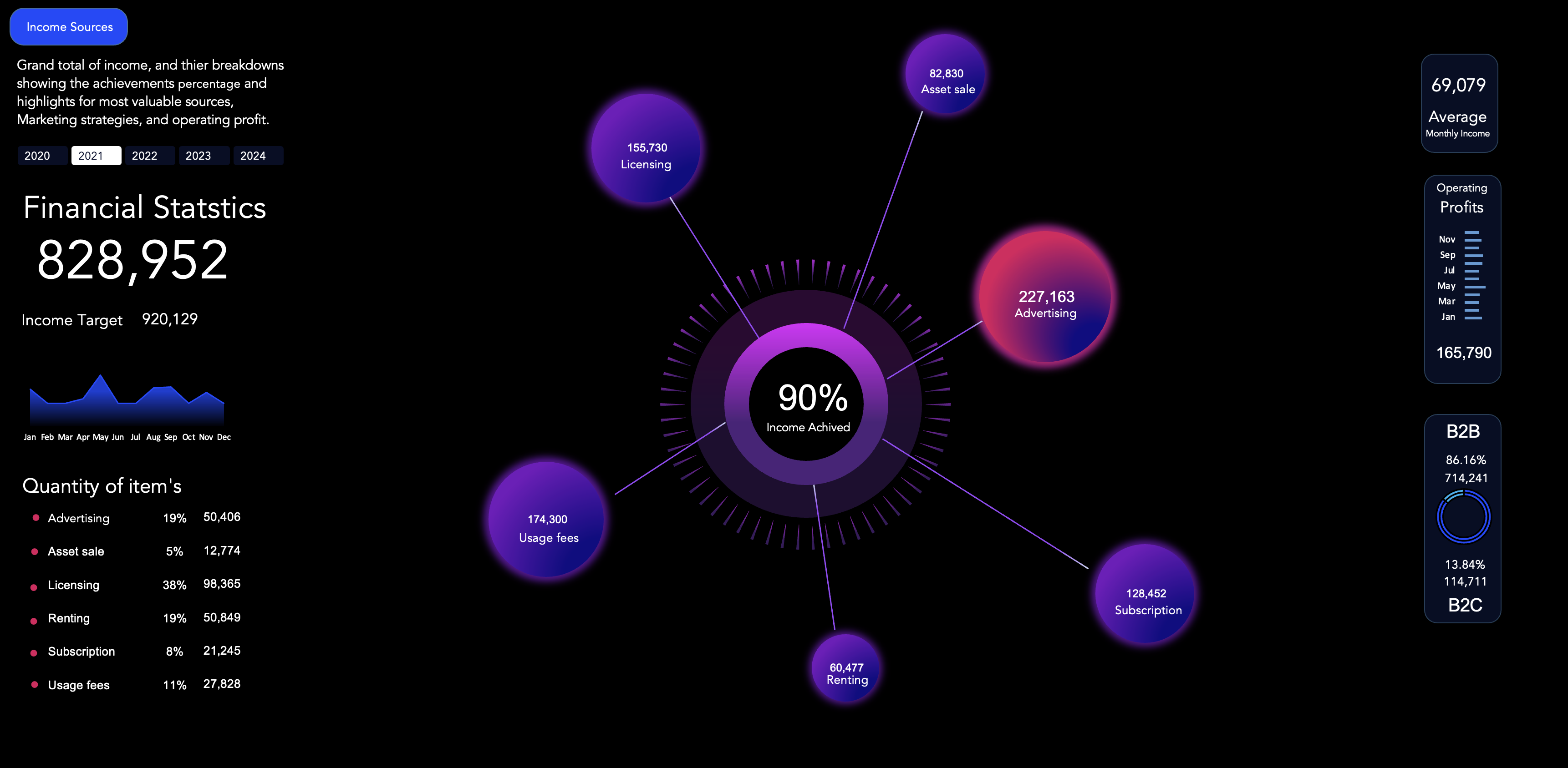
Figure 1: 2021 Financial Overview Dashboard
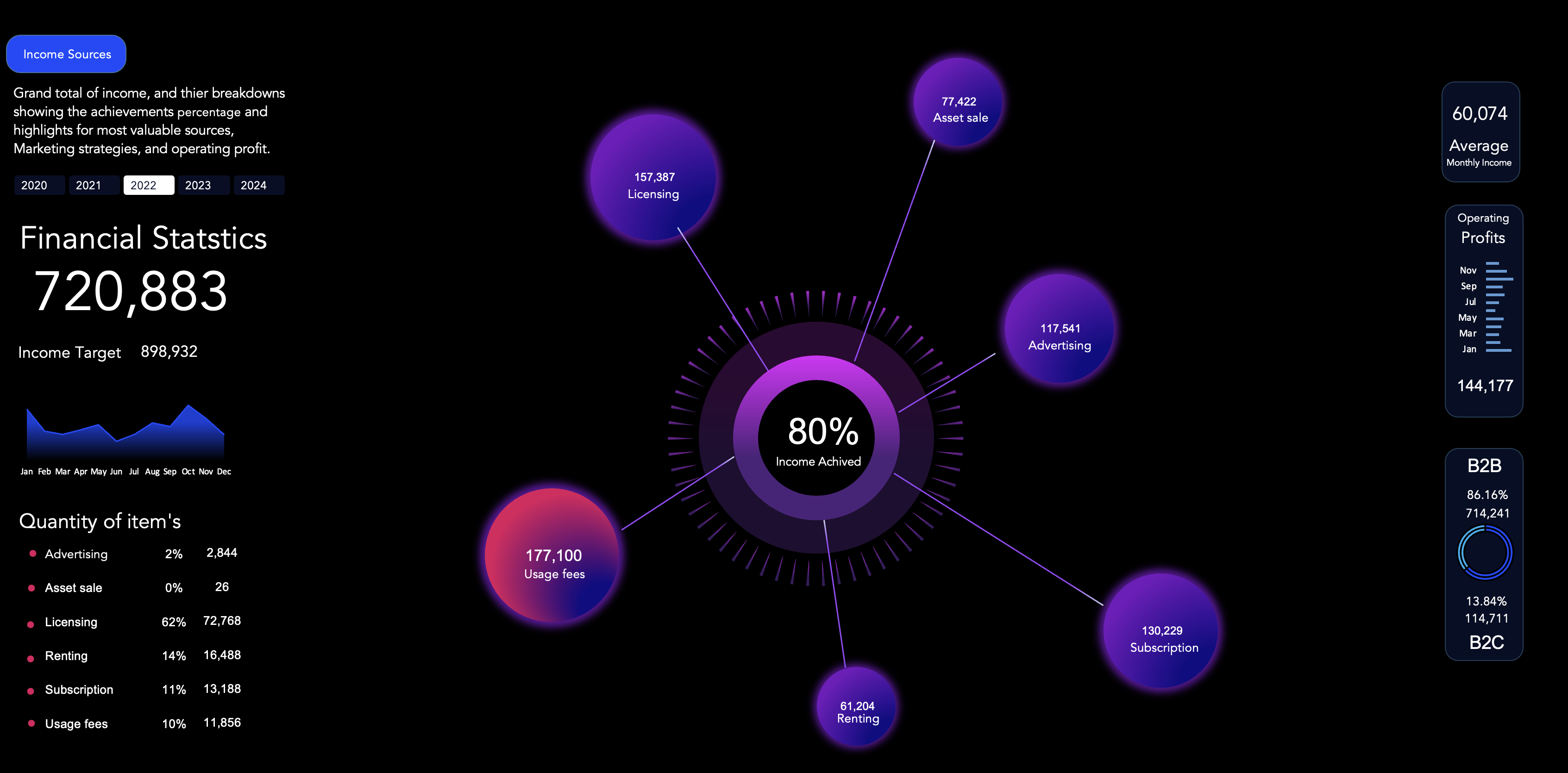
Figure 2: 2022 Financial Overview Dashboard
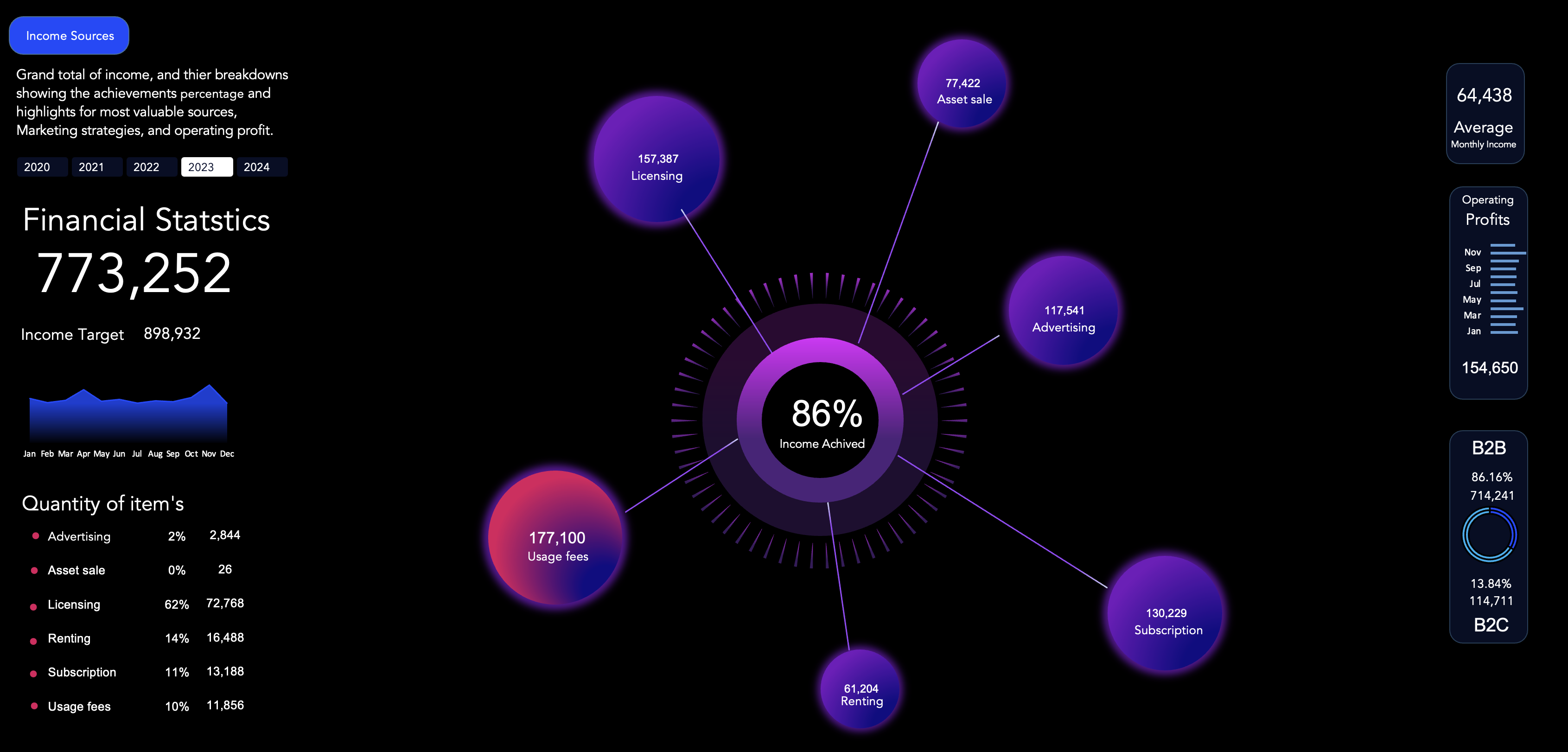
Figure 3: 2023 Financial Overview Dashboard
Overview
In this project, I've crafted a dynamic and comprehensive Financial Statistics Dashboard using advanced Excel functionalities. This dashboard encapsulates a detailed financial analysis for a hypothetical company, tracking its income streams and operational metrics over multiple fiscal years.
Objective
The aim of this dashboard is to provide a clear visualization of the company's financial health, breaking down various income sources such as advertising, licensing, asset sales, and more. By presenting these complex datasets in an intuitive and interactive format, stakeholders can easily discern trends, make informed decisions, and strategize effectively.
The dashboard is designed to ensuring that key financial indicators such as income targets, average monthly income, operating profits, and B2B vs B2C sales ratios are immediately apparent. Through the use of vibrant visuals and meticulous layout planning, I've highlighted the most critical data points for quick analysis and comparison.
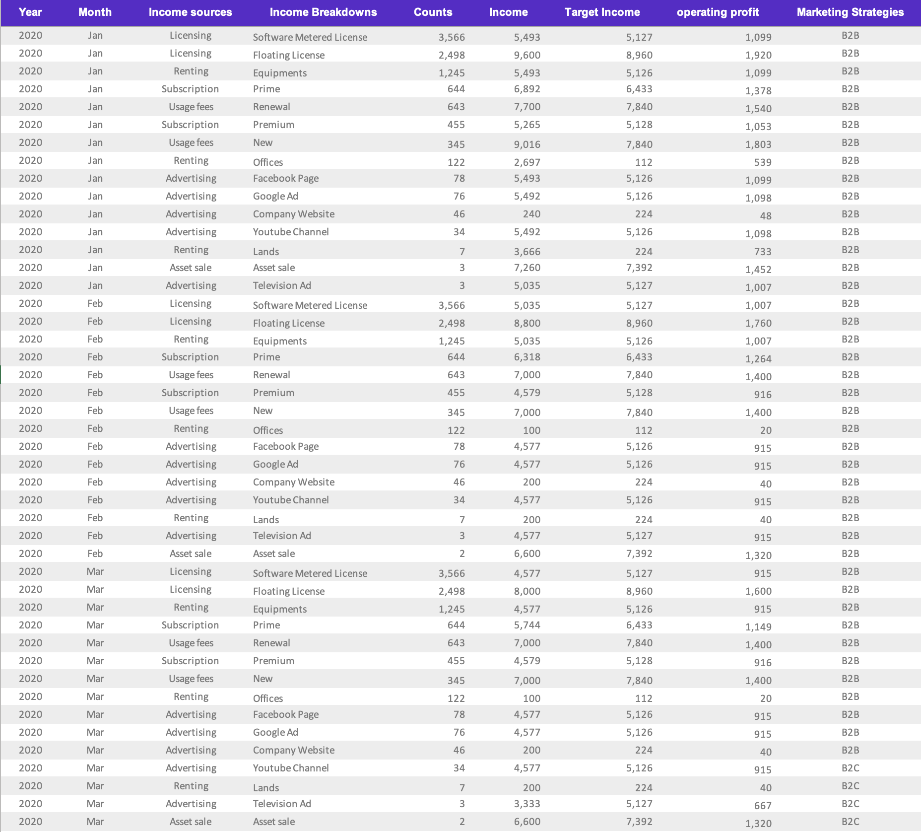
Figure 4: Data overview
Tools and Techniques
At the core of this Financial Statistics Dashboard is the adept use of Excel's PivotTables, which organize complex datasets into a coherent structure. Graphs, such as the central circular gauge and supporting bar charts, translate these figures into visual form. Strategic use of color not only adds clarity and visual appeal but also aids in distinguishing between different data segments, such as income sources and B2B vs B2C sales, at a glance.
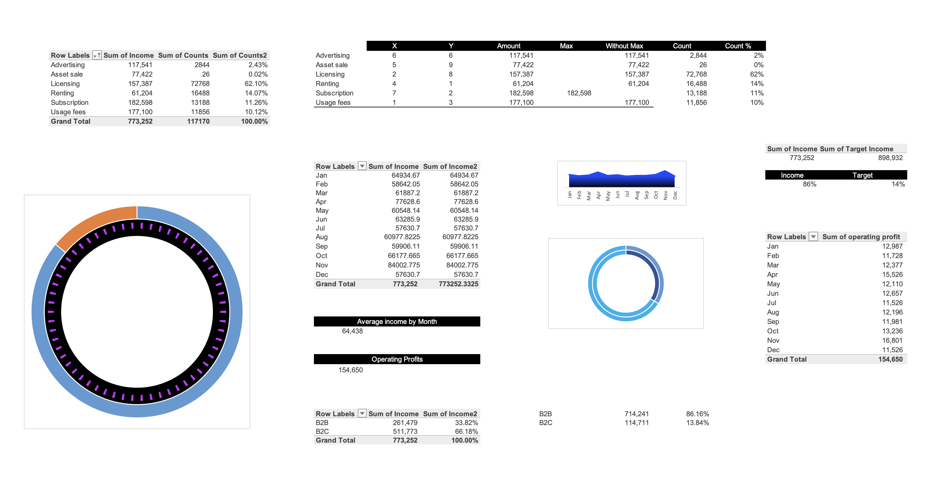
Figure 5: PivotTables used to make Dashboard
Insights and Analysis
The Financial Statistics Dashboard offers a detailed look at the company's income performance, with a central gauge showing that 90% of the income target has been met. This achievement reflects the company's strong financial planning and market strategy.
Reviewing the income sources, we see a diverse range of revenue streams. Licensing has been particularly profitable, bringing in 155,730 units, indicating effective use of the company's intellectual property. Advertising also made a significant impact, with 227,163 units, underscoring the success of the company's marketing efforts.
Digging further, we find usage fees have contributed a notable 174,300 units, with subscriptions adding 128,452 units, highlighting a business model that connects with customers at multiple levels.
An analysis of the monthly income, averaging at 69,079 units, shows a predictable pattern, useful for forecasting and identifying seasonal trends. The stable operational profit, totaling 165,790 units for the year, suggests efficient cost management.
The clear distinction between B2B and B2C income, with B2B making up 86.16% of the income, shows the company's strength in commercial partnerships. The B2C sector, though smaller at 13.84%, is also a valuable component of the revenue, representing areas for potential growth.
This dashboard is more than numbers; it tells a story of the company's progress, resilience, and strategic insight. It invites users to explore in-depth and interact with the data to understand the company's financial journey.
Conclusion
This Financial Statistics Dashboard serves as a testament to the power of data visualization in conveying complex information succinctly. It is a prime example of how I leverage analytical tools to create meaningful and visually appealing narratives out of raw data.
Explore the Dashboard
For an in-depth exploration of the data and techniques used in this dashboard, feel free to download the Excel file here.